Misguided #1
Your portfolio website design isn't a place for creative expression — your art is.
Don’t distract from your work.
Your portfolio website design isn't a place for creative expression — your art is.
Don’t distract from your work.
Having a portfolio or blog with a black background and white type. Readability is reduced and using black is a gimmick to make your art look better than it really is.
Don't fool yourself.


Today we were pointed to some paintings by an artist friend. The paintings were wonderful at least best we could tell. The images were a bit small. We were distracted by buttons to follow or like, photos of friends, and the most ugly and disturbing of all — paypal buttons.
Dear artists, blogs are not portfolio websites.
Heavybubble has released a new design called concrete.
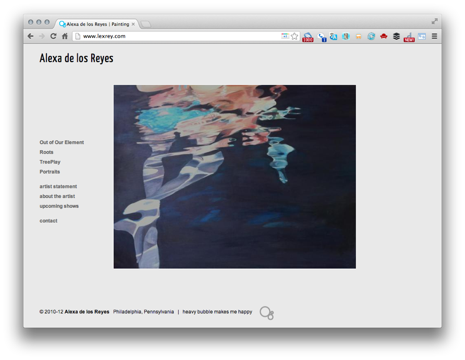
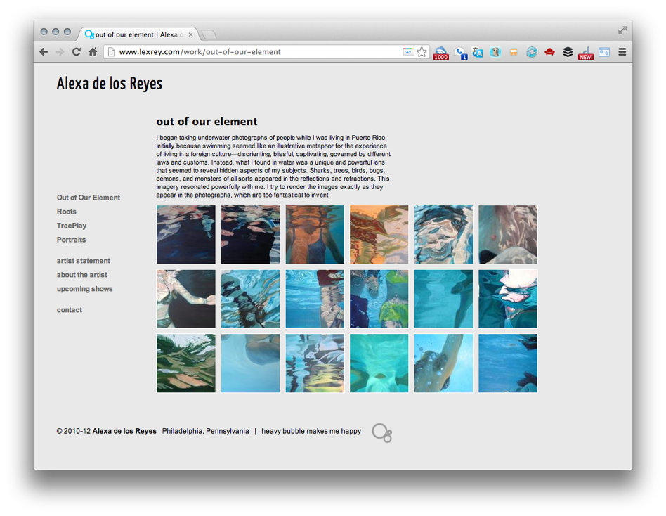
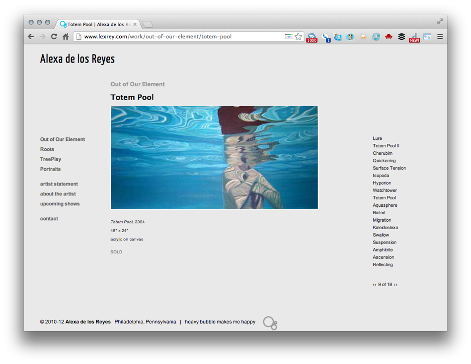
Our new design sports a very light neutral gray background. We've added a thin white border around the images to help keep the color saturation from being dulled where it meets the background.
SPECIAL OFFER : The first 25 new artist sign ups! Half Off for POST [Philadelphia Open Studio Tour participants].
Heavybubble has released a new design called stone.
The new design includes a text option on the gallery opener. Artist Jaume Pinya of Majorca, Spain uses it to provide an description in both Catalan and English. The gallery view uses a smaller view of an entire art work. Each gallery screen contains only four images/works and includes links to the next and previous four images. The design centers in browser window.
Mr Pinya cleverly used a gallery opener to create a statement screen that included two photos.